UI / UX Design
Virtual Tour App
UI/UX Design project to promote RIT through a virtual campus tour for prospective students.
Year :
2023
Role :
Education
Client :
Rochester Institute of Technology
Project Duration :
13 weeks

CONTEXT
Reimagining Virtual Tours
I designed low- and high-fidelity concepts for the virtual tour app and presented a modernized brand direction to stakeholders. The goal was to increase engagement with younger audiences by reimagining the campus tour as a social media-style web app.
PERSONAS
Two Perspectives guiding this app
01.
Prospective Student
Veronica needs an engaging and personalized way to explore RIT virtually so they can better understand campus life before deciding to enroll.
02.
Business Admistrations at RIT
RIT’s admissions and business team needs a modern digital tour experience that markets the university and engages prospective students to strengthen RIT’s online presence and recruitment goals.
GROWING PAINS
Customer Focus
RIT prioritizes accessibility, especially through its affiliation with the National Technical Institute for the Deaf (NTID), which supports Deaf and hard-of-hearing students. Keeping these values in mind, it was important that the virtual tour experience reflected the same level of accessibility and care.
But How?
User Testing!
The Setup
The goal was to assess and evaluate the usability of the new setup wizard page with 8 participants.
The Discovery
Feedback: Multiple participants physically squinted and leaned toward the screen. More than half of the participants skimmed. Frequent User Feedback: "The text is too small and difficult to read."
Insights: Our initial layout formatting and font scaling failed to meet accessibility standards.
The Turning Point
Since the feedback used keywords associated with accessibility challenges, I led the design by utilizing WCAG AA.


Results
Secondary user testing showed a 100% task completion rate on the wizard page. This led to higher engagement and customer satisfaction on the wizard page.
Hierarchy and Creating Impact
Area of Opportunity
Usability testing revealed confusion around the homepage layout. Users struggled to understand its purpose, and the visual hierarchy made it difficult to navigate.

Exploring existing solutions in the market (AirBnB)
We felt stuck trying to improve the page's hierarchy and organization, so I explored other digital experiences for inspiration.
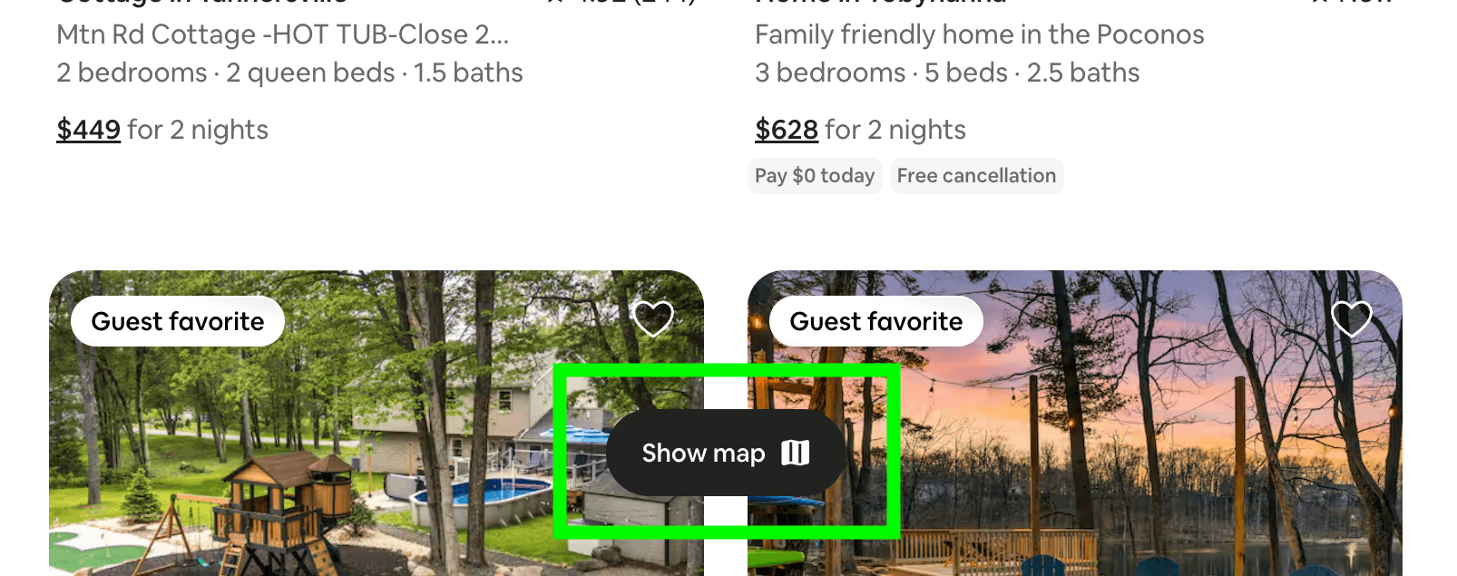
Airbnb's map experience inspired a simpler way to switch between content and map views. After positive feedback from peers, stakeholders, and users (used apple store reviews to confirms airbnbs user experience), we incorporated the pattern into the final design.
Design Impact

GROWING PAINS
Customer Focus
RIT prioritizes accessibility, especially through its affiliation with the National Technical Institute for the Deaf (NTID), which supports Deaf and hard-of-hearing students. Keeping these values in mind, it was important that the virtual tour experience reflected the same level of accessibility and care.
But How?
User Testing!
The Setup
The goal was to assess and evaluate the usability of the new setup wizard page with 8 participants.
The Discovery
Feedback: Multiple participants physically squinted and leaned toward the screen. More than half of the participants skimmed. Frequent User Feedback: "The text is too small and difficult to read."
Insights: Our initial layout formatting and font scaling failed to meet accessibility standards.
The Turning Point
Since the feedback used keywords associated with accessibility challenges, I led the design by utilizing WCAG AA.
Results
Secondary user testing showed a 100% task completion rate on the wizard page. This led to higher engagement and customer satisfaction on the wizard page.
Hierarchy and Creating Impact
Area of Opportunity
Usability testing revealed confusion around the homepage layout. Users struggled to understand its purpose, and the visual hierarchy made it difficult to navigate.
Exploring existing solutions in the market (AirBnB)
We felt stuck trying to improve the page's hierarchy and organization, so I explored other digital experiences for inspiration.
Airbnb's map experience inspired a simpler way to switch between content and map views. After positive feedback from peers, stakeholders, and users (used apple store reviews to confirms airbnbs user experience), we incorporated the pattern into the final design.
Design Impact
RETROSPECTIVE
Reflections
If I were to revisit this project, I’d involve accessibility-focused users earlier in the design process to to better reflect the diverse needs of prospective students worldwide.
Figma Links
More Projects


New release
Preview
UI / UX Design
Virtual Tour App
UI/UX Design project to promote RIT through a virtual campus tour for prospective students.
Year :
2023
Role :
Education
Client :
Rochester Institute of Technology
Project Duration :
13 weeks
CONTEXT
Reimagining Virtual Tours
I designed low- and high-fidelity concepts for the virtual tour app and presented a modernized brand direction to stakeholders. The goal was to increase engagement with younger audiences by reimagining the campus tour as a social media-style web app.
PERSONAS
Two Perspectives guiding this app
01.
Prospective Student
Veronica needs an engaging and personalized way to explore RIT virtually so they can better understand campus life before deciding to enroll.
02.
Business Admistrations at RIT
RIT’s admissions and business team needs a modern digital tour experience that markets the university and engages prospective students to strengthen RIT’s online presence and recruitment goals.
GROWING PAINS
Customer Focus
RIT prioritizes accessibility, especially through its affiliation with the National Technical Institute for the Deaf (NTID), which supports Deaf and hard-of-hearing students. Keeping these values in mind, it was important that the virtual tour experience reflected the same level of accessibility and care.
But How?
User Testing!
The Setup
The goal was to assess and evaluate the usability of the new setup wizard page with 8 participants.
The Discovery
Feedback: Multiple participants physically squinted and leaned toward the screen. More than half of the participants skimmed. Frequent User Feedback: "The text is too small and difficult to read."
Insights: Our initial layout formatting and font scaling failed to meet accessibility standards.
The Turning Point
Since the feedback used keywords associated with accessibility challenges, I led the design by utilizing WCAG AA.
Results
Secondary user testing showed a 100% task completion rate on the wizard page. This led to higher engagement and customer satisfaction on the wizard page.
Hierarchy and Creating Impact
Area of Opportunity
Usability testing revealed confusion around the homepage layout. Users struggled to understand its purpose, and the visual hierarchy made it difficult to navigate.
Exploring existing solutions in the market (AirBnB)
We felt stuck trying to improve the page's hierarchy and organization, so I explored other digital experiences for inspiration.
Airbnb's map experience inspired a simpler way to switch between content and map views. After positive feedback from peers, stakeholders, and users (used apple store reviews to confirms airbnbs user experience), we incorporated the pattern into the final design.
Design Impact
RETROSPECTIVE
Reflections
If I were to revisit this project, I’d involve accessibility-focused users earlier in the design process to to better reflect the diverse needs of prospective students worldwide.
Figma Links
More Projects
New release
Preview